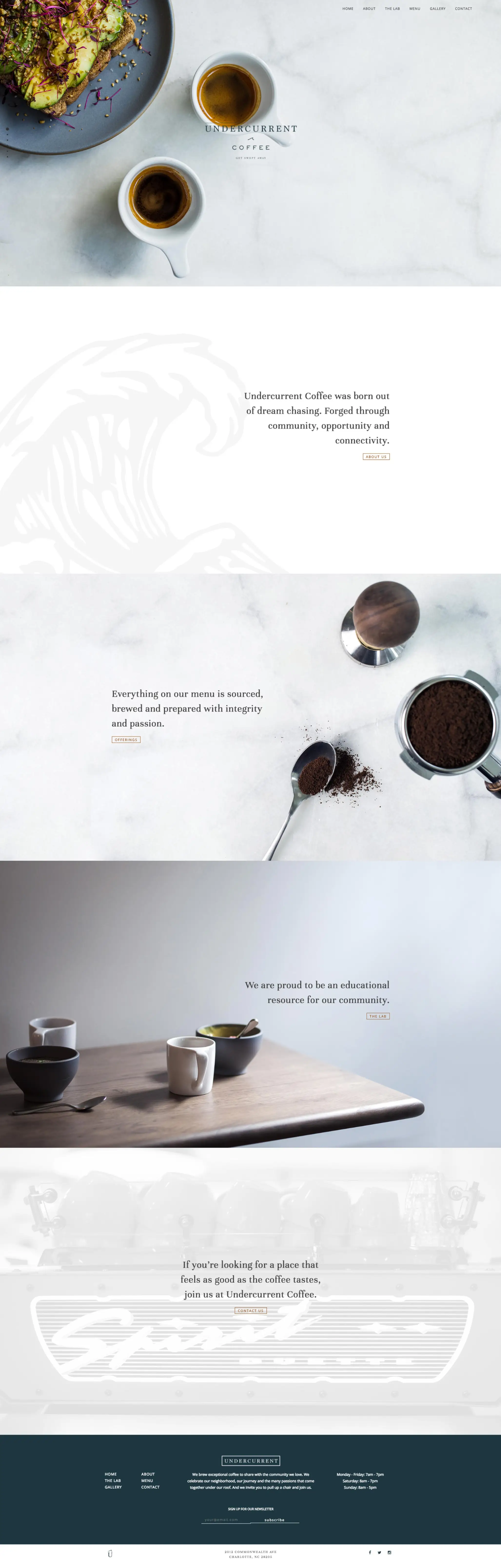
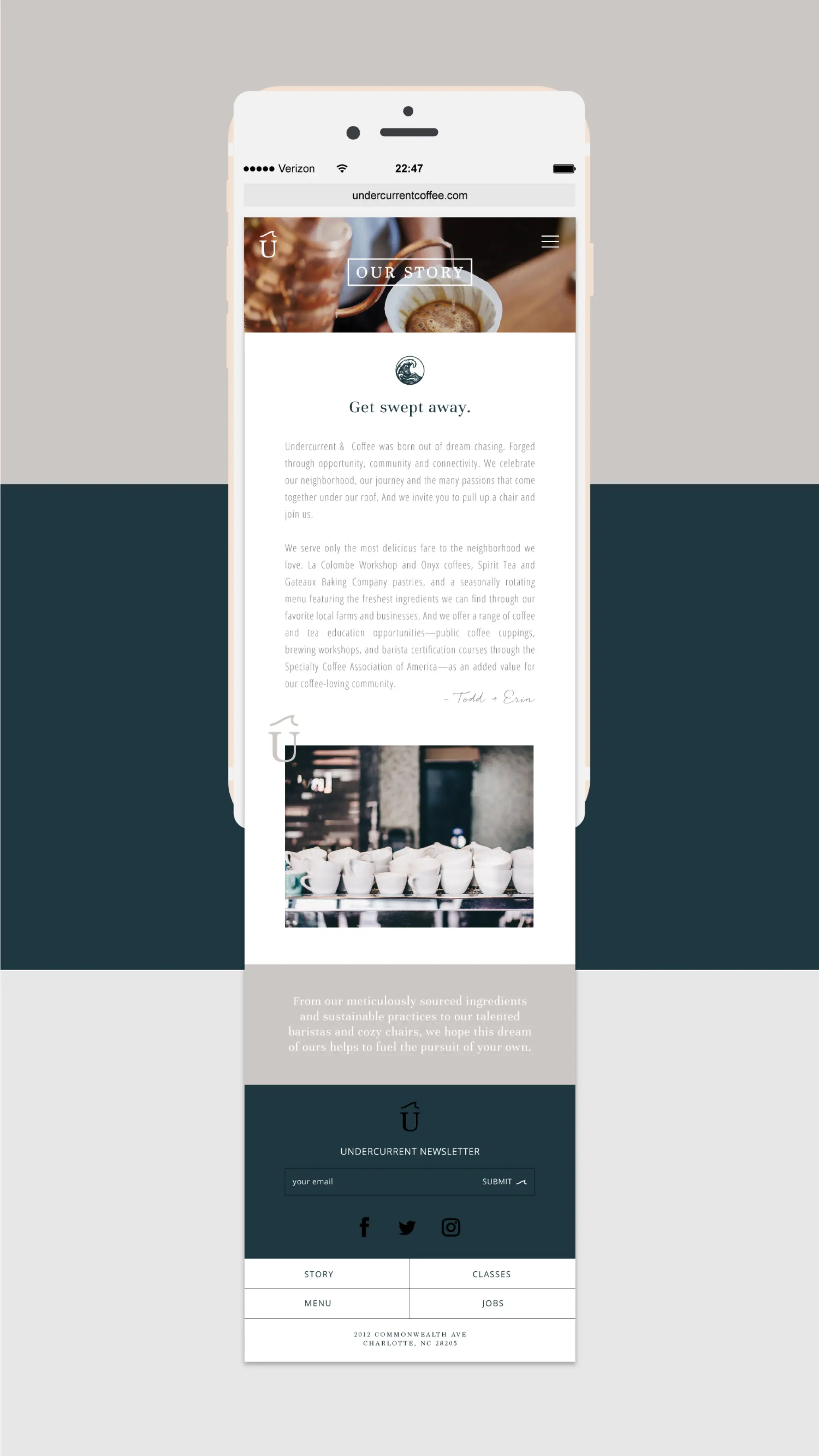
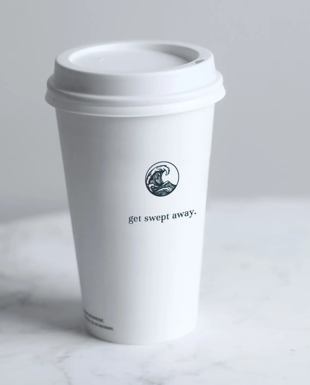
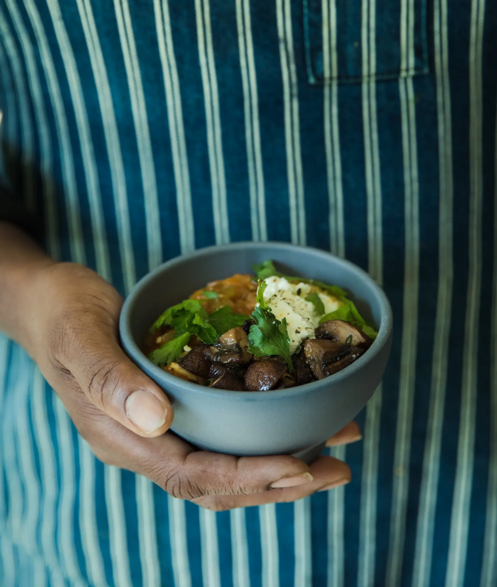
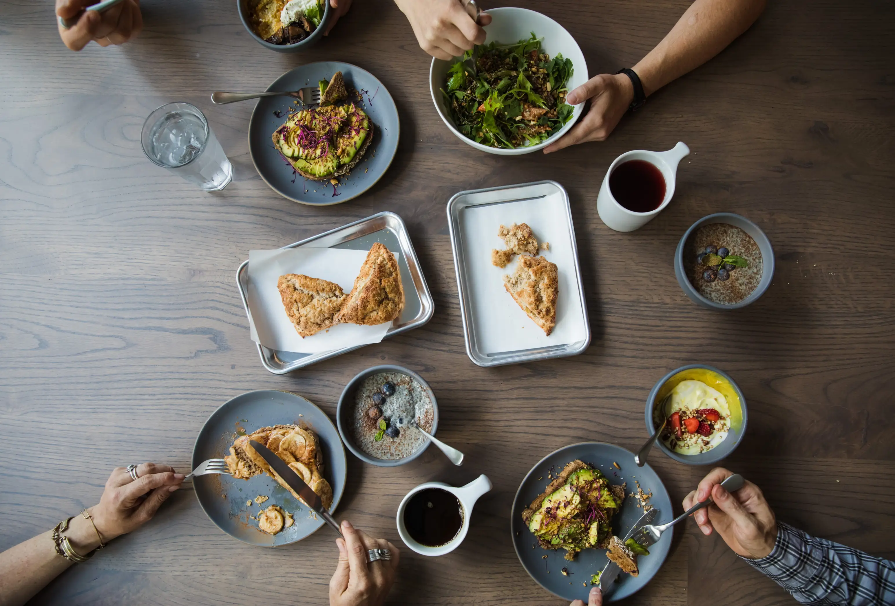
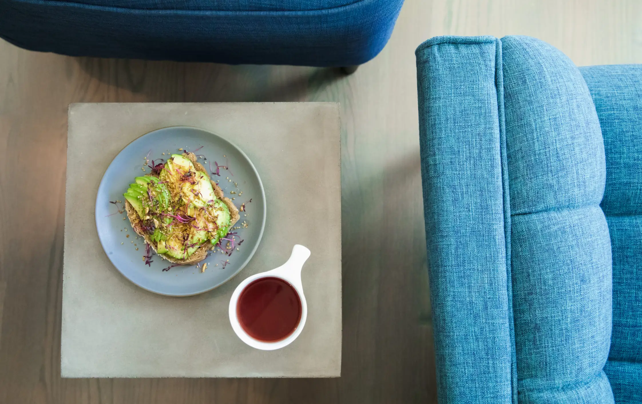
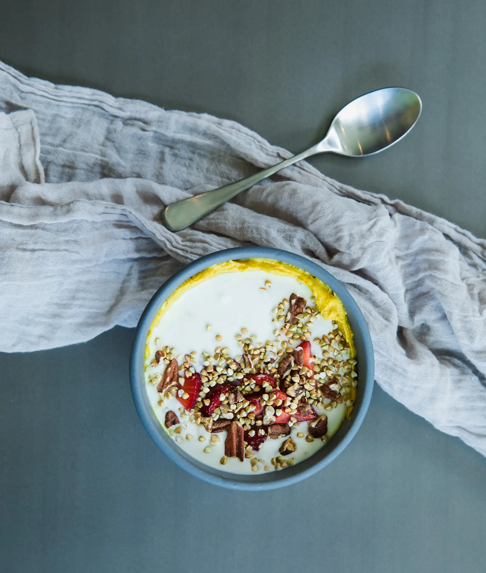
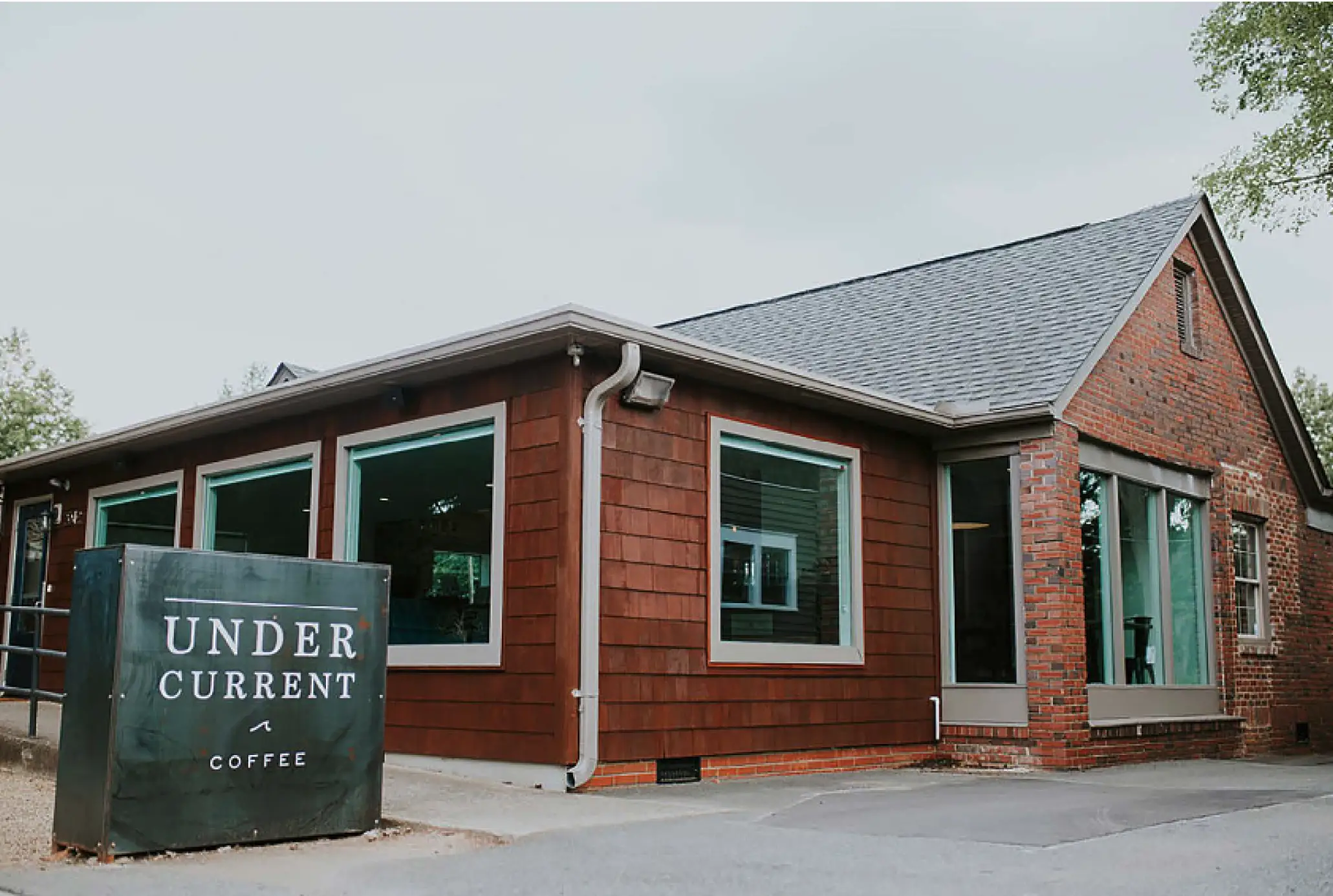
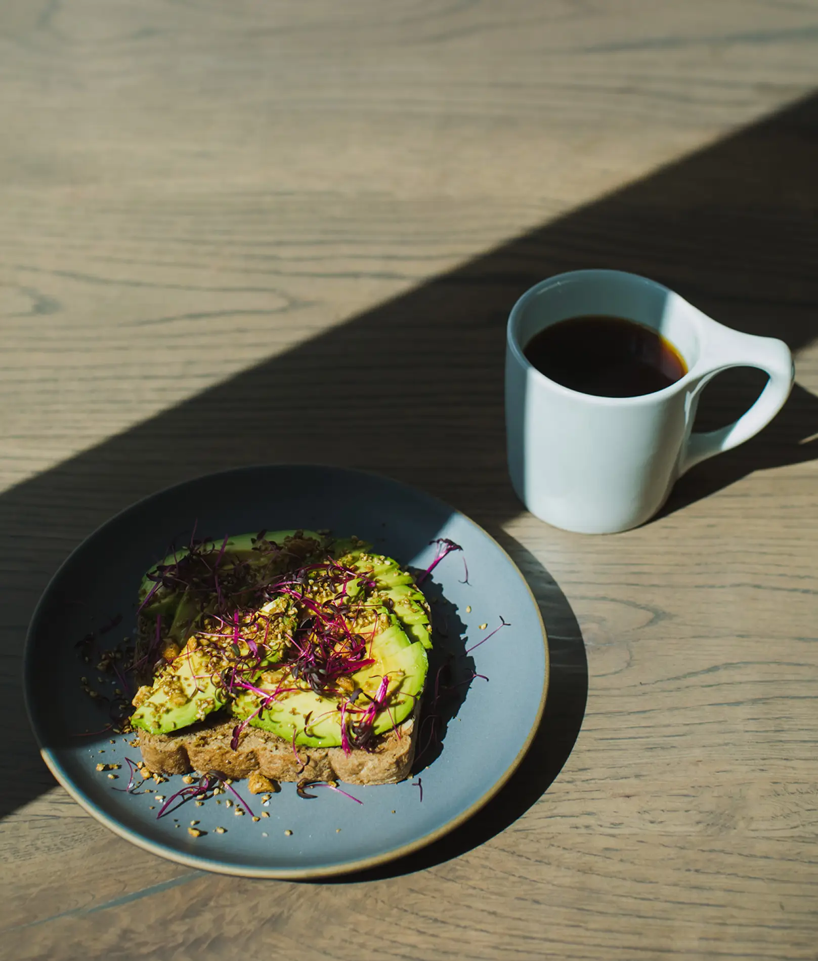
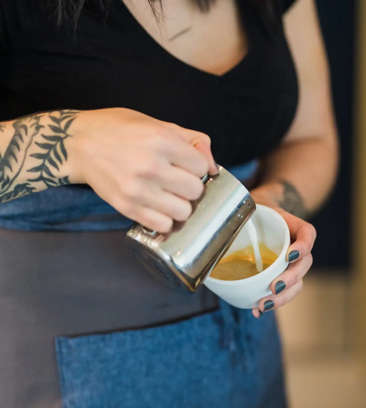
Undercurrent Coffee, founded by Todd and Erin Huber, set out to create a cozy neighborhood coffee shop focused on ethical and sustainable practices. Kara’s team helped build their brand from the ground up, and today, Undercurrent is a thriving local favorite. With intentional sourcing, healthy food options, and passionate staff, the brand has resonated deeply with its community.
Undercurrent Coffee, while driven by a clear vision of ethical sourcing and community connection, needed to establish a cohesive brand identity that resonated with its values and attracted loyal customers. With numerous local coffee shops in the area, they faced the challenge of standing out while staying true to their mission of sustainability and neighborhood appeal. The goal was to create a brand experience that would not only draw people in but foster long-term relationships with the local community.
The Solution
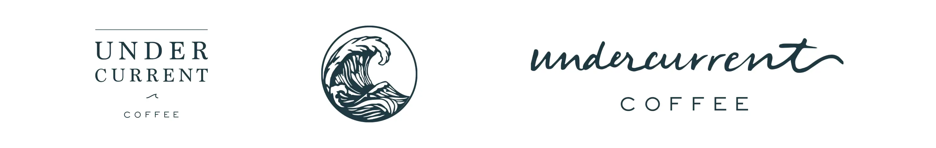
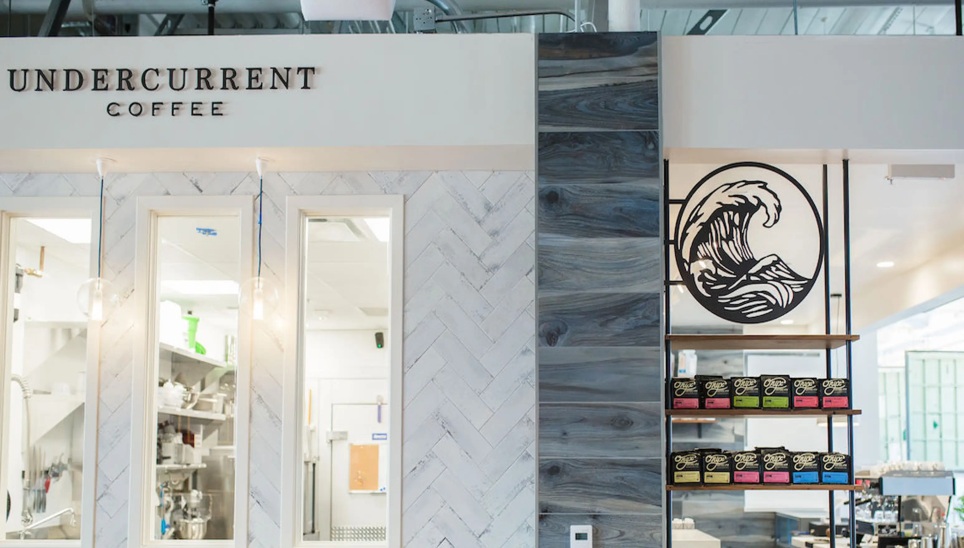
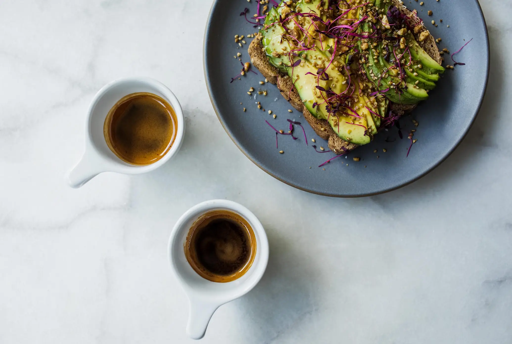
Kara’s team developed Undercurrent Coffee’s brand through messaging, photography, website design, menu design, signage, and more, emphasizing its inviting atmosphere and ethical values to stand out in the coffee shop industry. This branding success led to a second location and a strategic partnership with Not Just Coffee and Nightswim, doubling their footprint and expanding their influence within the local coffee community.
The selection below includes photography from Made Outside and Undercurrent Coffee.
Discover how Made Outside can assist your company. Schedule a 20-minute call to discuss your needs and goals. We’ll provide an overview of Made Outside and explore how we can support your business, helping you achieve clarity and direction.
Learn How Your Company or Brand Can Capitalize on a $15 BILLION Industry that Keeps Growing.
A huge market shaped by new consumer preferences is unfolding and many brands are missing out. Learn how understanding and adapting to consumer behaviors can drive growth and customer loyalty in a competitive market.
"*" indicates required fields
LET’S BUILD a brand that matters. LET’S ACCELERATE your growth. LET’S CREATE a company built on purpose. LET’S DEEPEN your consumer connection.